 |
| Leslie station - eastern entrance |
I dislike it for a bunch of reasons, the prime one of which I have to acknowledge isn’t rational. You see, it’s because Leslie is your destination if you’re taking the subway to North York General Hospital.
 |
| North York General Hospital overlooking the East Don River |
And I hate hospitals. Notwithstanding their essential and positive role in the community, hospitals make me sad. For many people—like myself—Leslie is unavoidably emotionally associated with illness, worry, and piercing sorrow. I know that’s not the station’s fault. But every step of that pedestrian-unfriendly hike to NYGH is fraught with pain.
The stop also ostensibly services the nearby IKEA North York (notably connected by a regular shuttle for customers), the Canadian College of Naturopathic Medicine, and Canadian Tire (sort of). But realistically, how many IKEA and Canadian Tire shoppers take the subway to this location? Who in their right mind is going to schlep that BILLY bookcase onto the subway?
The walls are decorated with 17,000 ceramic tiles that display the handwritten text ‘Sheppard’, ‘Leslie’, and a printed ‘&’: part of Ampersand, an installation by Micah Lexier, whose work often involves repetition in large quantities.
 |
| 17,000 of these, collected from the community. |
I appreciate the scope, effort and intent (expressing ‘the duality of being both an individual and part of a larger community’), but I find the overall effect lamentable: at a distance the tiles resemble the temporary wall panelling often used in construction sites, and as a result, the station looks unfinished [For his part, Lexier contends it looks like wallpaper]. Some people enjoy speculating as to the background, gender and personality of the tile writers; this graphological conjecture bores me.
 |
| The panelling looks like crap. And the concourse level appears to be mostly unnecessary. |
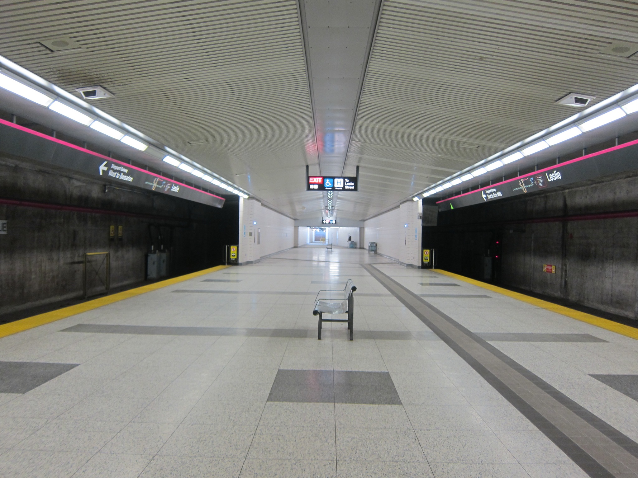
The rest of the station fails to excite. The bus platform’s miserly concrete floor is brutal; meanwhile the concourse makes one regret the wasteful nature of the Sheppard line—by which I mean, the construction of facilities disproportionate to the actual usage (about a third of the original starry-eyed projections). Two decades later, it’s clear to any observer that a smaller, more modest station could have been built. Or rather that the line itself should never have been prioritized, with the fund differential directed towards another capital expenditure of higher priority.
Sorry for the negativity; this journey is supposed to be about celebrating the subway! On the plus side, the station does have 102 spaces of commuter parking.
 |
| The awful, unfriendly concrete expanse of the bus platform. Thanks for nothing, Al Palladini. |
Designed by Moriyama & Teshima Architects, Leslie station opened on November 24, 2002. The station was constructed in challenging soil conditions, owing to its relationship with the river, the extant grades and roadways, and proximity to the college buildings; the technical complexity won the station an Award of Excellence from Canadian Consulting Engineer. The street (and the Leslieville community) is named for George Leslie, the Scottish gardener who established Toronto Nurseries in 1845, which became the largest business of its type in Canada.
 |
| A bench in the middle of nowhere. Its placement captures my sentiments about the Sheppard line. |
Bonus photo: You may have heard that one of the tiles is misspelled at Leslie station. In fact there is more than one. With a careful eye you can easily find an example in about 15 to 30 minutes of searching (and you’ll also gain insight into the humanity of Lexier’s work—something I did not fully appreciate on my initial viewing).
 |
| It’s not merely an urban legend. Can you find the ‘Waldo’ tiles? |
Postscript: I’ve subsequently been forced to reconsider my feelings about Ampersand. I’ve come to realize that the participatory nature of the work redeems it—at least for the many people who responded to Lexier’s call to action. My stimulating experience with making designs for Sherbourne’s The Whole Is Greater Than The Sum of Its Parts opened my eyes to the powerful emotional tie that can be forged, when a collaborative permanent artwork is installed at a transit facility. I remain unimpressed by the visual appearance of the tiling, but I have been partially won over on the conceptual side of the art.
Photo Gallery
Tour the station:(hint: turn on the captions)
Transfer:
 |
| Leslie station transfer |
More about Leslie
TTC Station info | Map | Wikipedia: LeslieMy next stop: Chester
Previous station: Bessarion
Alphabetical Station Selector


